So I reinvented the wheel once more. Just my cup of tea. So I built a component on top of pyqtgraph (which to my surprise was both well-written and performant) to draw the charts, handle the proper zooming, share the X-axis between plots, deferred rendering during zooming/panning and all of this with a clean API and good defaults. It turned out really good, and I named it finplot.
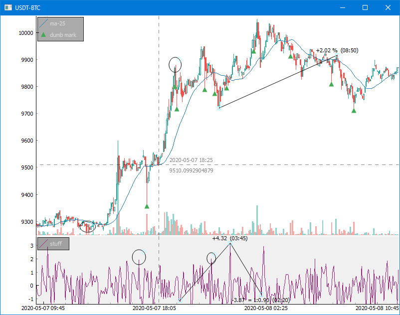
Even though I thought I went off the rails again for two days, this side track was actually pretty good. I really needed both volume and candlesticks en masse, along with my own generated markers, etc.
So far my trading up until now has been shit all along. I'm down by 58% since December. (Market's down by 68%.) I wrongly assumed it was possible to use simple close price statistics over time to be profitable. I should have known better, but naïve as always and it never pays.
I've learned my lesson, studied some and think I'm on to something much better. So far I've only evaluated buying, which is much easier than selling, as a missed buy opportunity doesn't hurt my wallet (only my future excessive spending).
If you feel like one sneak peak at Bitcoin plotting, my whole example is less than 25 lines and sets you up for everything you need to start hacking away at your own algorithm. Happy hacking!